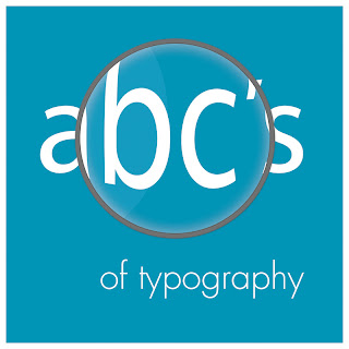
after a lot of swearing and hair pulling i managed to get things right at least i think i did. here is my cover for the abc's of typography book that we're creating in our print design class. my aimed target audience are elementary students. i wanted a simple layout and used a light shade of blue to help my book be inviting as well as using it through out the composition. i decided to add the magnifier to say that typography is something worth looking at in detail, in that there's more to typography then fonts and size. so if you look deeper there's a whole shett of knowledge to help you as a designer. the question now is which one should i choose black or white? if any of you have any suggestions feel free to let me know.