
Nov 29, 2007
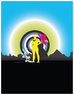
dvd cover_eclectic superheroes
my first go at my dvd cover. i have various cartoon footage of superman, mighty mouse and bugs bunny. i decided to go with a super hero theme and focus on their smiles. cool colors rounded out the color palette. don't know what else i should do or whether to bring it in photoshop or keep it in illustrator. wat to do......wat to do.
Nov 24, 2007
fooooooood!
oh so hungry. its hard to work when foods on your mind, but when is it not. i'm actually waiting for my trip to maui cuz i'v been craving the macadamian nut crusted mahi mahi stuffed with lobster and crab topped with a pineapple beurre blanc sauce. here,s a secret you can actually get it with the wasabi beurre blanc. seared ahi, shoyu poke and fresh sashimi to start. to top it off the creme brulee in the end is a must mmmmmmmmmmmmmmmm. just thought i'd write what was on my mind. bak to work now. here's a peak from the table looking outside.


Nov 23, 2007

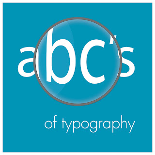
abc's_of typography
after a lot of swearing and hair pulling i managed to get things right at least i think i did. here is my cover for the abc's of typography book that we're creating in our print design class. my aimed target audience are elementary students. i wanted a simple layout and used a light shade of blue to help my book be inviting as well as using it through out the composition. i decided to add the magnifier to say that typography is something worth looking at in detail, in that there's more to typography then fonts and size. so if you look deeper there's a whole shett of knowledge to help you as a designer. the question now is which one should i choose black or white? if any of you have any suggestions feel free to let me know.


Nov 18, 2007
a cry for help
this here was a side project i started out a month ago and finally completed. it was a contest sprung from unicef in collaboration with unite against aids to produce a 30-60sec video. there were some stressful times about direction, composition, song, and everything in between. the overall objective was to find the mood and story line to somehow connect the audience to the video. i played with color corrections and in the end the black and white won out with little color to them. i chose sarah mclachlan's world on fire song because i think it touches the heart better than the rest of those i had to choose from as do all her other ones. with this project i went through about 5 different iterations before i felt satisfied with the video.
a cry for help from jenerek b on Vimeo.
a cry for help from jenerek b on Vimeo.
juice_musik
my 2nd project assignment for 3d and one that had no reference but the name itself a music television channel in new zealand. i liked the name juice and stuck musik next to it because it sounded really well together. i was playing around with the cloner object and set it to linear also animating the strength value. the spline effector was also added to link the spheres to the text spline. the lights in the background was the only thing with the sound effector attribute. being that it was done in a day i am satisfied on how it turned out, though the song wasn't a personal choice and cuckoo was the only song i had in a music format at the time. i think it went fairly well with the composition. everything is in 3d with a little bit of after effects work in the end. drink up.
juice_musik from jenerek b on Vimeo.
juice_musik from jenerek b on Vimeo.
Subscribe to:
Comments (Atom)